Monday, February 29, 2016

Weathered Florals Club Scrap Artist Team Challenge

YES!  Today is the Club Scrap Artist Team Challenge for February.  Our challenge was to incorporate the set of Weathered Florals stamps in our projects.  Boy, I have been waiting for this reveal for a while now.  I wanted to share this technique for quite some time but I never had the right set of stamps to set it off BUT these stamps compliment the technique perfectly.  So very excited to finally get to share it with you!


The Halo Effect Stamping Technique

Most of the time you don't want a halo effect when talking about stamped images but this time it's exactly what you want!  The Halo Effect is achieved by pairing a lovely "line stamp" with white pigment ink on dark colored cardstock.  


Begin by stamping one or more images onto a piece of dark colored cardstock using white pigment ink.


Use a Fantastix to drag the pigment ink away from the edge of the stamped image.  You can drag in the ink a short distance (as I did in the first card) or you can cover the entire panel (third example) if you'd like.   It gives the image a lovely "halo" of ink - hence the name.  Since you are using pigment ink there is no need to hurry as it has a very long open time allowing you to take your time and have fun with it.


It's hard to see in the photo but the center flower is actually pop-dotted off the card as are a few leaves.  I used a little longer stroke for the halo on this card compared to the first.    I also picked up excess ink off of my craft mat to darken it around the flowers as well.


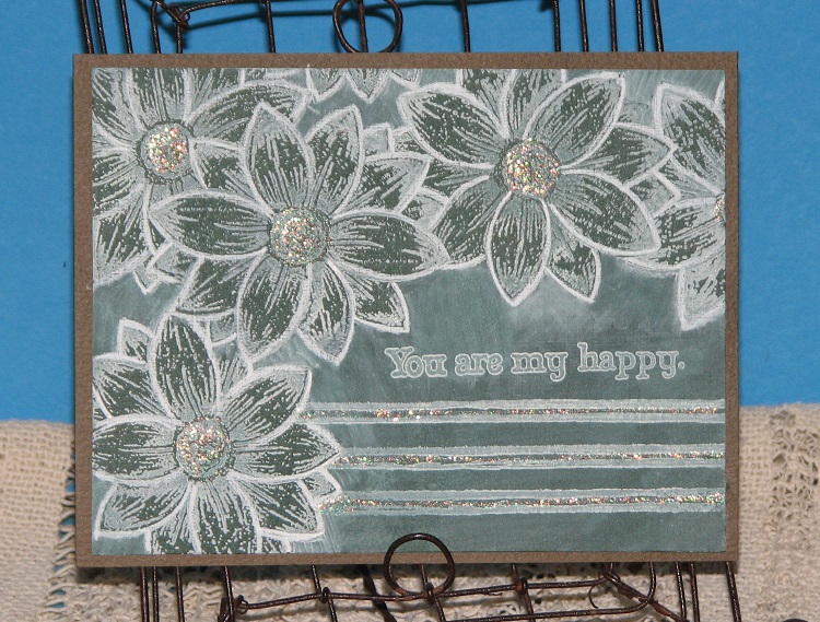
The third example has an all over halo which gets lighter the further away from the flowers. The finished card looks a bit like a chalkboard.  After the ink had dried I went back with a "charcoal white" pencil and freshened up all of the flower edges to really make them pop.


Finally I have a watercolor card just for the fun of it.

Your next stop on the hop is:


if you get lost along the way
the entire list can be found here:


Thanks for stopping by friends!!

Supplies:

ClubScrap.com - Weathered Florals Cardstock & Stamps; Crewel & Unusual Cardstock & Stamps
IMAGINE Crafts - Memento Ink - Tuxedo Black
Watercolor Paper
Kuretake Gansai Tambi Watercolor Paints
Glitter Glue

Friday, February 26, 2016

Floral Radiance

That's the name of the challenge over at 

and here is what I created...


I was so inspired by both the colors and the photo which is why I decided to join in on the fun.  Normally I don't create much with orange and yellow but the inspiration photo was just so pretty I was sure I could do something with it.  You can't really tell in the photo but the card panel is matted with both a rose pink and orange making the flowers pop even more IRL.


Supplies:

Altenew - Peony Bouquet, Painted Greetings
IMAGINE Crafts - Memento Inks 
Clubscrap.com - Cardstock
Watercolor Paper

Thursday, February 25, 2016

Product Review - Loew-Cornell Simply Art Watercolors

Loew Cornell WATERCOLOR CAKES Simply Art 36 Paint 1021095 Preview Image

Disclaimer - I bought these paints with my own money and I'm not being compensated in any way to talk about these products.  I'm sorry if you don't like my opinion but hey, photos speak louder than words.  You be the judge.

It's not very often that I review a product and tell you not to buy something but I think this is going to be one of those reviews.  I keep seeing people talk about these paints proclaiming how great they are for watercoloring.  Well, I needed a few $'s to get free shipping on my last order at Amazon so I bought a set to try.


So mostly when I see these paints they are being used to make the popular swishes of color or very similar techniques where they are being used for single layers of color. Yep, as you can see in the example they look very pretty.  The wide selection of colors allow you to make just about any color "swish" you want.  Really nice for basic techniques.


But wait...I had noticed when I first opened the paints that the cake looked a bit chalky but when you let a drop of water sit on the cake it looks like wet chalk - it's got the same consistency too?!?  I've never seen a watercolor paint react like this before... It's more than a little strange.


O.k...so I go ahead and paint my stamped image....I noticed right away that it takes quite a bit of paint to even cover the image.  I'm sure this is because the paints have way less pigment than some of the better brands of watercolor out there.  

When the paint started to dry it looked VERY chalky over the stamped lines.  It's so opaque unlike normal watercolors - it literally looks like a layer of chalk.  So much so that when you add a second layer it totally obliterates most of the finer detail stamped lines.  I also noticed that the colors are very matte...not vibrant at all.  Again, it looks just like chalk.


After the paint had dried I wanted to give it a smudge test because it looked so chalky. Sure enough, with the simple swipe of my finger across the painted surface the paints smeared across the paper and a chalky residue was also left on my finger tip.  

So I go to move the panel after it's dry and I "thought" I dropped a flake of something on the panel - but then I realized what actually happened....  A flake of the paint actually popped right off the paper!!  You can see in the photo where it came from the center of the flower on the right.  


O.k.. that's really odd - so my first thought is that it might be the paper.  So I switched to a different brand of watercolor paper and the same thing happened.  Definitely not normal!  Can you imagine painting a card then trying to send it through the postal system?  


This photo shows the two examples painted with the LC paints and the top image was painted with my Kuretake Gansai Tambi watercolor.  Quite a noticeable difference I'd say.

My conclusion:

I can without a doubt say if you want to make wispy swishes of color or very basic single layer techniques these paints are wonderful. I am going to keep these paints just for that purpose.  I can use these instead of my nice (a.k.a. expensive) watercolor paints for simple watercolor techniques.  I'm all for saving $'s which is what I can do with these.

Now, if you actually wanted to "paint" an image (stamped or otherwise) with these watercolor paints - run the other direction.

So I guess what it comes down to is what you wanted to do with them....if you just want something quick, cheap and easy for a splash of color - perfect.  If you wanted to do something more in depth then forget it...not worth your time or $.

Also, I must note that these paints are being sold under several different brand names so use caution when purchasing any similar looking paints.

Again, remember, these are just my own unbiased opinions...I'm not being paid to talk about this stuff and I bought it with my own $'s.   You don't have to agree with me but again, the photos show it all.

Wednesday, February 24, 2016

Crewel & Unusual Club Scrap Blog Hop

Welcome, welcome friends

This month's Club Scrap Kit - Crewel & Unusual is such a fun kit to work with.  To begin with the name really threw me when I first heard it...so I had to look it up.  I knew crewel had something to do with needle work but nothing beyond that - it's one of the few arts & crafts I haven't tried - LOL!! So, here's what I came up with...  Crewel, crewel work or crewel embroidery is traditionally a wool product stitched in a linen twill.  It's not a counted type stitch but more free-hand allowing a more artistic touch.  Apparently it's been around for quite some time...well over 1,000 years!  So there you go.

And here's what I created for you... A Crewel & Unusual Pocket Letter.  Pocket Letters, unlike Crewel, has been around for a relatively short period of time so they are just beginning to catch on.  You may or may not know, recently I hosted my first Pocket Letter Swap here on the blog and it was a resounding success. Most people already asking for another because it was so much fun! 


What is a pocket letter?  It's a fun way twist on pen pals.  You take a baseball card page protector, fill it with ATC size cards (2.5 x 3.5"), place goodies behind each card and a letter to the recipient tucked somewhere in one of the pockets.   Fun and easy!

Actually, this basic idea has been around for quite some time in different forms (among ATC swappers) minus the goodie stash but last year Janette Lane came up with the catchy little name and used Project Life cards as the inserts.  Since then popularity has been growing ever since.  Rubber stampers and paper artists have taken it a step further by creating their own art cards to personalize them and make them their own.

It's a really fun way to share a little bit about yourself, your art and some goodies all rolled into one. Pocket Letters are not only fun to make but receive as well. 


Here is a close up of the individual stamped cards....


The long stem flower was actually one of the printed cardstocks included in the kit. I cut it apart and embellished each card differently.  The top portion has pop dotted leaves, second card has a stamped sentiment "be" with a wood embellishment "happy" (that also came in the kit) and on the final card the stitching is highlighted with glitter.


And here's a peek at the back, filled (except for the note) and ready to be sent off to.....??????

GIVE A WAY ALERT!!!

That's where you come in!  Have you ever made a pocket letter?  Have you ever rec'd one???  Yes, No????  well, simply leave a comment telling me if you'd be interested in participating in a PL Swap.  If so you might be the person I send this PL off to!  

You have until 3-5-16 to post a comment, at that time I will select one person that I will send my Crewel & Unusual Pocket Letter to.
Good Luck Friends!

And keep your eye on the blog for another PL swap coming soon.

It's time to send you off to the next blogger...


And remember if you get lost along the way
you can find the complete list of hoppers here - 


Supplies:

ClubScrap.com - Cardstock, Rubber Stamps, Embellishments
IMAGINE Crafts - Memento Ink
Other: Page Protector, glitter, sequins, round mini brads

Tuesday, February 23, 2016

Watermelon Anyone?

I'm on a roll today - 
I made this card....


by combining these 2 challenges....


and


I don't know what it is but I'm really enjoying challenges right now.  I've also been finding inspiration in my coloring books too...  Maybe it's because it's been so nice here the last few days or the impending snow storm - LOL!!  I don't know but I've been very productive and so pleased about it all.  Hope you're all having a fun week!

Supplies:

ClubScrap.com - Cardstock, Stamps (Picnic)
IMAGINE Crafts - Memento Inks, Memento Markers
InkTense Watercolor Pencils

...what makes you Beautiful.

This month over at Our Creative Corner the challenge was to create a project focused on sewing...


 "Fabrics, wool, threads, lace - this months challenge is all about texture, layers and loveliness!

What scraps have you got hidden away? Any snippets of favorite clothes you can't bare to part with?

Anything sewing related can be used in your piece. You could use hand stitching or get out the sewing machine and don't worry if you are not a fan of sewing - why not try drawing in some fake stitches?  

Don't forget to get out your sewing themed stamps and dies.
Have fun and create something!"

*****************

SEW...I decided to take up the challenge
and here is what I created...


I started off with a piece of chipboard for my base to which I started adding layers.  A bit of white paint to start off with, then I adhered a bit of vintage sewing pattern tissue, bits and pieces from the envelope the pattern came in.  These were adhered using Sparkle Collage Pauge which has glitter in it to add a bit of sparkle!  After it had dried, I stamped stitches and sentiment (ClubScrap), and added  all sorts of vintage sewing items from my collection!   It's been a while since I made a collage and it felt so good!   I'm so glad I decided to join the challenge.


I added a couple of eyelets at the top and a pretty ribbon to hang it from.

Take It, Make It Challenge
TEXT ME!

As it happens this also fits into the challenge at Craft Stamper Magazine as their challenge this month is TEXT ME....use text in somewhere in your project.  I used the text from both the vintage pattern tissue paper and the text that was cut from the vintage pattern envelope it's self in the background.

and

Our Players Badge for Your Blog

Glitter!

I'd also like to enter it into the Mixed Media Monthly Challenge as the collage glue I used had glitter in it - making it sparklie all over!


Supplies:

ClubScrap.com - cardstock, rubber stamps, ribbon, heart brad
IMAGINE Crafts - Memento Ink, StazOn Ink
DecoArt - White Acrylic Paint
Sizzix - Die-Cuts
Collage Pauge - Sparkles
Vintage Sewing Pattern, Buttons, Lace, Sewing Ephemera - My Collection
Cardboard, Eyelets

Win a Painting Party from Blick Art Materials!!

I know what you're thinking...another fake give-away - but it's not - HONEST!

Blick Art Materials is giving away 5 painting parties - either Poppies or a Seascape.

I signed up for a chance to win and you can too!


Just go here - Win A Painting Party - to sign up for your chance to win!

Maybe one of us will win!!

Good Luck Everyone!!!


Monday, February 22, 2016

2016 Watercolor Calendar Round Up & GiveAway!

If you were with me on Friday you know we finished up the watercolor calendar for 2016.  Below is a list of each calendar page and a link (in the month name) to each technique.  

(Be sure to scroll all the way to the bottom....)


So, did you enjoy this calendar?
Did you have a chance to try one or more technique?
What was your favorite technique?

Well now's the time to tell me what you thought!
Because to celebrate finishing the calendar I'm going to give away a set of my favorite watercolor paints - this set of 36 Kuretake Gansai Tambi Watercolor Paints!


You may comment once if you tell me which was your favorite technique.

If you happened to try any of the techniques, you can post a link to your creation for another entry.  If you tried all 12, please feel free to post each link for up to 12 additional entries.  I only ask that you post current links relative to when I posted the calendar page - meaning no back-linking.

You have until 3-6-16 to post your comment 
and any additional links to your projects/calendar pages.

Friday, February 19, 2016

2016 Watercolor Technique Calendar - December

Today marks the final page in our watercolor calendar for 2016!  Hard to believe - it's gone by so quickly...  I know some of you have fallen behind but no worries - these pages will still be here when you can catch up.

Today's calendar page is probably going to be the most difficult for many people because there isn't much I can tell you other than to let your brush strokes be free....  Honestly it was difficult for me in the beginning.  You just have to practice random brush strokes and eventually you'll get it and once you do you'll love it!


Evergreens!  Yes, that's what we're painting today.  I know it sounds easy but it's much more difficult than you'd think.  For nice realistic looking pine trees you need flowing random sketchy lines. Free, loose designs is what it's all about.  


So I started off by practicing trees...  I painted a sketchy trunk for somewhere to begin.


Then I took my large flat brush and started working 2-3 colors of green, a charcoal and brown paints.  My first attempt was lots of straight lines back and forth. Very rigid and tight - not the look I'm going for.  Sort of looked like one of those fake Christmas trees you buy at a discount store - LOL!!


Adding snow made it look a bit better...


And some background color helped too but it's still not great.


O.k...so I then tried it with my 02 detail brush.  Much better - easier for me to get the sketchy look I was going for.  The green to the left was a miss step - I picked up the wrong green on my palette - shamrock green evergreen anyone?!?  NOT!


Wash that green off and add a few more trees here and there.  The longer I went the better they looked. 


Now for the calendar page...I started by making some sketchy trees here and there.  Remember this is about layers - make a sketchy start, move along and let it dry while you work on the next tree....  Eventually you will work yourself back around and can add more and more layers of greens, blacks, browns, white and even a touch of blue.

TIP - the further the trees are from you the darker they should be until they just fade into black.


Once you have your trees on there you can add some blue shadows and a darker shade of blue to the sky.  It was looking kind of bare so I flicked on a bit of the white, blue & grey/green over the panel.  I think it finished it off nicely.


All 3 attempts together....
You can really see the progression.


A couple of close ups of the finished calendar page trees...


Well, we're done - 2016 Watercolor Calendar in the books.
I hope you've enjoyed the techniques I've shared with you and give them a try.

Monday I will be posting a wrap up of all the links and finished pages together on one post.  I hope you will join me because I've got a special surprise for a lucky Ink Stained reader!!!

Have an inky weekend friends!